You can access the full course here: Bite-Sized Python Data Visualization
Part 1
In this video, we are going to be looking for 2 of the more common plots – the column and bar plots. There is a very small difference between the two and matplotlib gives us a way to use an almost identical API for both these plots.
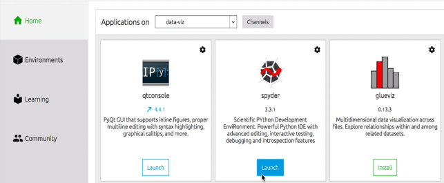
Lets start coding. Lets make sure we have chosen the correct environment and launch Spyder (our development tool).
Lets create a new Python script called column.py in the same folder as the pickle files (the matplotlib folder).
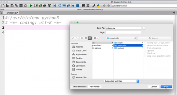
Lets import the relevant packages.
# import matplotlib.pyplot as an alias
import matplotlib.pyplot as plt

# python object serialization library
import pickle

# load data using with block (f is closed automatically after the block)
# rb means “read binary data”
with open ('fruit-sales.pickle', 'rb') as f :
    data = pickle.load(f)

print (data)
Lets run this code to see the data.
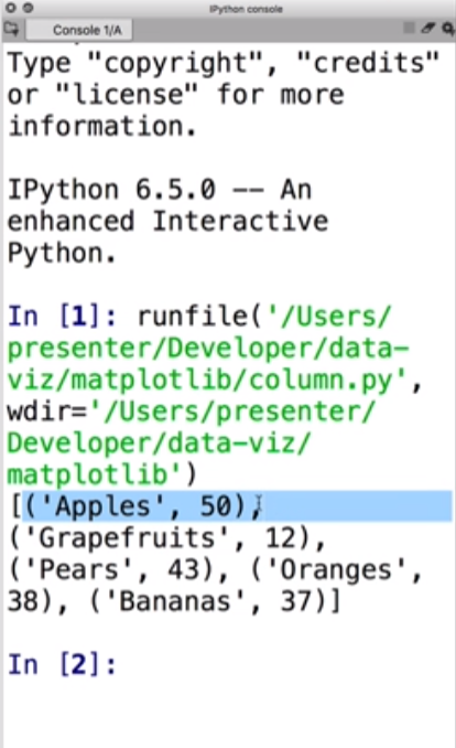
We see a tuple of elements each with the name of the fruit and the quantity sold. To make this easier to work with, lets split this tuple into 2 separate lists – one with the names and one with the numerical values.
#splitting a list into 2 lists
fruit, num_sold = zip(*data)
print (fruit)
print (num_sold)
Lets run the code.
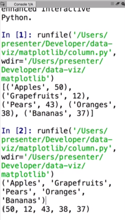
We can see the data in 2 different tuples now.
Let continue adding code to make the column plot. We need to tell matplotlib where to position the bars i.e. give it x-coordinates as in the diagram below.
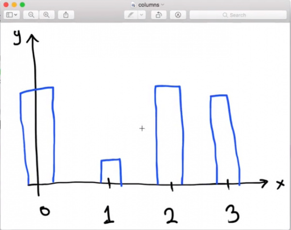
The bars are at positions 0, 1, 2, 3. Lets create a list containing these values.
# list from 0 – the number of fruit
bar_coords = range(len(fruit))

# tell matplotlib to plot this

# second argument specifies the height of the bars
plt.bar(bar_coords, num_sold)

# show plot
plt.show()
Lets run this code.
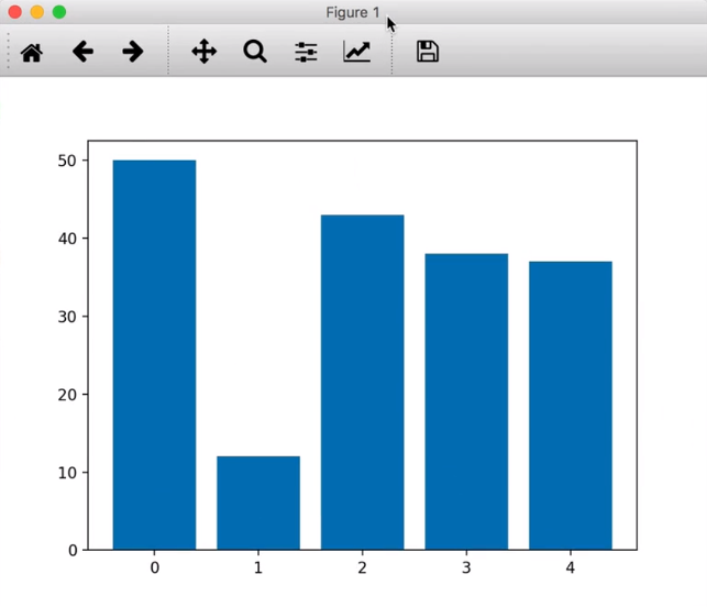
As expected we see the bars centered around 0, 1, 2, 3, 4.
The matplotlib documentation has a list of all functions we can use to produce various kinds of plots.
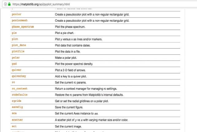
As we can see, there are APIs for all kinds of plots – histograms, spectrograms, 3D plots, contour plots etc.
Lets look at the API documentation for bar plots.
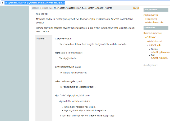
We can see the parameters above. Scrolling down there are other parameters we can change such as color, linewidth etc.
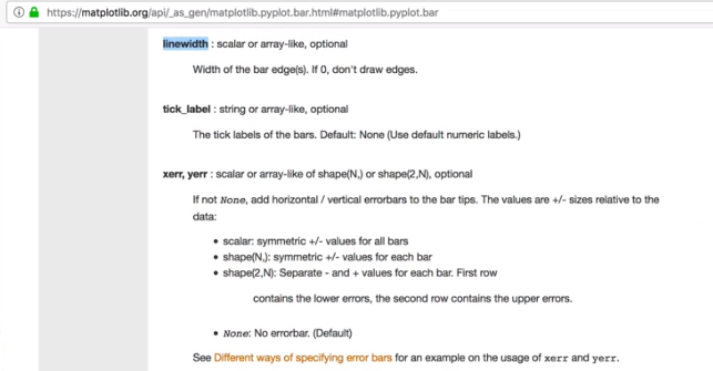
At the bottom of the page are some examples of how to use the bar plot API.

Our column chart works, but does not really look nice. Lets add a few features like a plot title, axis labels. Lets do that in the next video.
Part 2
In this video, we are going to make our plot look nicer by adding labels on the axes, the title. New code segments will be marked as # NEW.
Lets start with the code we wrote for the plot so far.
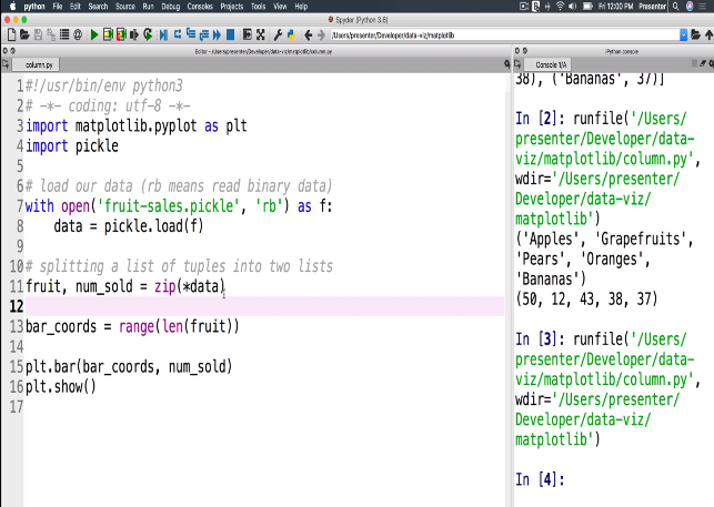
There are 2 ways we can view these plots. One was in a separate window as we showed in the previous video.
The other way is to have it display inside the iPython console. This is convenient when you don’t want to launch a separate window for the plot.
To do this, we need to change some preferences in Spyder. Open the Preferences dialog as follows :
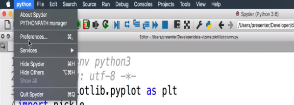
In the Preferences window, go to IPython console => Graphics.
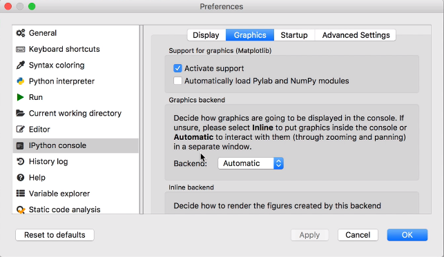
If the Backend option is set to Automatic, the plot will open in a separate window with buttons that you can use to manipulate the plot. If you select Inline, the plot will show in the console but there won’t be any buttons to manipulate the plot with. After making a change to this setting, you’ll need to quit Spyder and restart it.
Lets start making our chart look a little better.
# import matplotlib.pyplot as an alias
import matplotlib.pyplot as plt

# python object serialization library
import pickle

# load data using with block (f is closed automatically after the block)
# rb means “read binary data”
with open ('fruit-sales.pickle', 'rb') as f :
    data = pickle.load(f)

#splitting a list into 2 lists
fruit, num_sold = zip(*data)

# list from 0 – the number of fruit
bar_coords = range(len(fruit))

# tell matplotlib to plot this

# second argument specifies the height of the bars
plt.bar(bar_coords, num_sold)

# NEW
# add plot title
plt.title(' No of fruit sold(2017)')

# show plot
plt.show()
Running the code, we get:

We see the plot title we just added.
Lets set an axis label for the y-axis.
# NEW
plt.ylabel('Number of fruit(millions)')
Running the code after the above addition, we see.
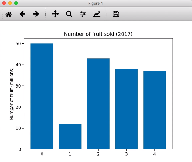
We see the label along the y-axis. The pyplot documentation will show ways we can rotate this label by 180 degrees.
We can setup the x-axis so that instead of 0, 1, 2, 3, 4, we can use the actual fruit. We use the matplotlib xticks function. The fruits are split in order with the zip function. so we don’t have to worry about the correct order.
# NEW
# replace bar_coords with fruit names
plt.xticks(bar_coords, fruit)
When we run this code, we get:

We see the fruit names on the x-axis. Apples sold the most. Grapefruits did not sell as much. So column bar charts allow us to look at the data and infer information from it. The x-axis has categories and bar charts are very good to depict categorical data. The term bar charts and column charts are used interchangeably.
Summary
So we saw how to add annotations such a title, y-label etc. to any matplotlib chart we work with. Like ylabel, we have xlabel that lets you label the x-axis. We choose not to do it since we have fruit names on the x-axis.
Transcript 1
Hello, world, my name is Mohit Deshpande. In this course, we’ll be learning all about plotting. So plotting is a fundamental aspect of doing any kind of data science, or really just science in general. It’s the ability to take your data and present it in a nice, clean way that’s easy for people to understand.
So, you see here we have different kinds of plots, and these are all using different plotting libraries that we’re going to be learning about. So the three big plotting libraries that are out there that we’re gonna be discussing is Matplotlib, Seaborn, and Bokeh, and all of them provide different advantages as to how you want to display your data, and they provide very nice APIs for you. They just consume your data and then present a very nice-looking plot that’s completely customizable. So this is what we’re gonna be learning, we’re gonna be learning the APIs of these libraries, as well as how to create beautiful plots with all of these libraries.
We’ve been making courses since 2012, and we’re super-excited to have you onboard. Online courses are a fantastic way to learn new skills, and I take a lot of online courses myself. Zenva courses consist mainly of video lessons that you can watch at your own pace, as many times as you want, you can always go back and rewatch videos as many times as you want. We also have downloadable source code, and project files, and data, and they contain everything that we’ll be building in the lessons.
It’s highly, highly recommended that you code along with me. In my experience, it’s the best way to learn something is to get your feet wet, get your hands dirty with the code, so coding along with me will really help you get a good understanding of the code and what’s going on. And lastly, we’ve seen that we notice the students who get the most of these online courses are the same students who make some kind of weekly planner or schedule and stick with it, depending, of course, on your own availability and learning style.
So over the past eight years or so, Zenva has taught all different kinds of topics on programming and game development to over 300,000 students, and this is across about 100 courses. And the skills that they’ve learned in these courses are completely transferable to other domains as well. In fact, some of these students have used the skills that they’ve learned in these courses to advance their own careers, to start a company, or publish their own content from the skills that they’ve learned. Thanks for joining, and I look forward to seeing all the cool stuff that you’ll be building.
Now without further ado, let’s get started.
Transcript 2
So let’s get started with some imports. And so the first thing we need to import is of course Matplotlib and all of the plotting functionality is in a submodule called pyplot. We want to load our data with open, and then inside here we want the file name. And our data’s stored in a file called fruit-sales.pickle. And this would just open it as a text file, but for efficiency, I’ve saved the data in a binary format, so we have to tell Python to read from a binary format, so that’s what this RB stands for.
So we’re now reading binary data and then as F links this, it creates a variable F that represents this file. Okay and then I use a colon here to set up an indentation block. So inside of this block, now I can do anything with F, this file, that I want, and then after I get out of this indentation block it will automatically close the file for me. So then I’ll just load my data. So let’s see our data, let’s see our data somewhere on this guy.
As you can see we have, it’s actually a list of tuples. Each tuple has a name of a fruit, and then the quantity that sold. So it’s in this format, but what we can do to make our lives easier to work with, is we can split this list of tuples out into two separate lists. So essentially, we’ll have one list that has all of the fruit, and another list that has all of the numerical values.
So using a Python function called zip, so I can say fruit and num_sold equals zip, and then there’s a special operator that we have to use here, there’s a special syntax. It’s star, or asterisk, and then data, and what this does is this is going to split our list of tuples into two separate lists. So fruit will have all of our fruit here, and then num sold will have all of our numerical data. So this is what we want the result to kinda look like.
We need to tell Matplotlib where to put these bars. so we need to create a list where we say zero, one, two, three, and then we can give that to Matplotlib, and Matplotlib will know where to position it. Bar coords, range, length of fruit. So what this will do is this will create essentially a list that goes from starts at zero and goes up to however many fruit we have.
Plt.bar, and the first input to this guy is going to be these coordinates, so I have to tell Matplotlib hey here are the coordinates. And then the second argument is how tall do I want the bars? And that’s just the num_sold here. Now this is going to set up our bar plot, and then to show it we have to call plot.show. so I’m gonna call this guy and now that I have this, I can actually run this and we should be able to see our plot.
So here is our plot. So you see we have these bars here, and their positioned at zero, one, two, three and four because we told Matplotlib to do that.
Transcript 3
In this video, we are going to make our plot look a bit better and then add things like labels on the axes, and the title. So we can have a look at a function on plot called title that I can add, and you can look at the documentation for there’s a bunch of other arguments that you can go with this. But we will just say, let’s give it a simple title. So number of fruit sold 2017. So here in the figure that shows up, we have a title at the very top here. There are other configuration options as to where do you wanna put the title.
The other thing that we want to do is set a title or an axis label for the y-axis, y-label, and that will label the y-axis for us. So I can say number of fruit, and this will be in the millions. And we see that on the left, you see that there is the Number of fruit (millions) label on the y-axis.
The one last thing that we need to do is set up the x-axis so that instead of saying 0, 1, 2, 3, 4, we use the actual fruit x-ticks. We are essentially going to take the numbers and replace them with ticks. So we need to tell Matplotlib which of the numbers we wanna replace and what we wanna replace them with. So we wanna replace these r-coordinates here with the fruit here. So if I run this guy again, you see that now, we have replaced the 0, 1, 2, 3, 4 with the actual names of the fruits, and we have a completed chart here.
So you can see that apples sold the most and grapefruits apparently didn’t quite sell as much, and oranges and bananas were very close, pears were a little bit more, but not quite as much as apples. So using this bar chart, we can look at different kinds of information and gain some insights out of this. So these kinds of column charts are great for categorical data, so here in the x-axis, we have categories, and then we have a numerical value assigned to each category. So these kinds of bar column charts are great for this kind of categorical data.
And then I’ll just make one last subtle point is that these are technically called column charts, but you’ll hear people call them bar charts all the time. They’re really just interchangeable depending on how you wanna show the bars.
Interested in continuing? Check out the full Bite-Sized Python Data Visualization course, which is part of our Bite-Sized Coding Academy.


